Type Tools
Creating and Editing Type
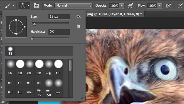
Use the Type tool (t) to add text. Once selected, the cursor will turn to the familiar text I-beam symbol. There are some other options here, the first two change the orientation, the second two turn your text into masks.

There are two way to add text – 1 Point text, click and start typing. It will flow on one line and off the document if it goes past the canvas size. You can add new lines with the return key. You can reposition it by clicking away and dragging. 2. Area type, click and hold make a box, which the text will remain inside of. Once again you can reposition by clicking and dragging outside of the box. Confirm the type by clicking the check box in the options bar.

Note that there are the normal font options here as well. The fonts available to you depend on the ones you have installed.
To reselect a text box, click on it with the type tool. You can resize by dragging on the tT icon next to the font size as well. If it’s in point (pt), and you’re doing web design, you should change it to pixels instead by going to Photoshop > Preferences > Units and Rulers. Change both type and rulers to px.


The next option affects anti-aliasing. This adds transitional pixels on the edges, blending the font with the background.

The next few options are text align, font color, and to warp the text into a shape. You can choose a style, then adjust it with the options below.


Character and Paragraph Panel
These panels provide more options in addition to the type tool option bar. Select them under the menu option Window. For the character panel. you can hover over the icons to the left and click and drag to adjust them, like you can for the font size in the type options bar.
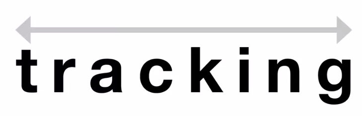
The first section lets you choose font/font style. The second is for size and spacing. Here, first is font size. Next is letting, which is the vertical space between lines of text. After that is kerning, which adjusts the space between two specific characters. To adjust that, you’d use the cursor to select a spot between two characters first, then adjust the value. Next is tracking, which is for the overall spacing between all the characters. To adjust this, you would first need to select a range of characters.
The next section is for transform options, to make the text taller, wider, adjust the baseline and the color.
The last selection is for making selections faux bold or italics, all caps, all lowercase, superscript, subscript, underline and strikethrough. Finally, there’s an another anti-aliasing option.
Be careful with the faux bold/italics, and vertical/horizontal scaling options, as these are simulated effects and not part of the typeface.


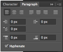
The paragraph panel lets you change the formatting of columns and paragraphs. The first section is for alignment and justification. The second is for indentation, and the third is for setting an indent for the first and last lines of the text. Lastly, you can choose whether text hyphenates.
Type Layers and Smart Objects
When you add text, it appears as a layer and is marked by a T symbol. But what if you want to add an effect, like a blur? You’ll get an error saying the type has to be rasterized first, and will no longer be editable. Click Rasterize to do this.

The layer no longer has the T thumbnail, and now has a checkered one. You can no longer edit the text.
A better way to do this is to convert to smart object, which you can also do by right clicking and selecting the option. We can now apply the blur with no error message popping up. You’ll notice the thumbnail is different now to. Double click on it to open a new document window for the smart object. Here you can edit the text to something different and save it. You can disable the filters on the object like you would any other layer using the eye icons. Another good feature is that you duplicate the type and make an update to it, it will duplicate in all instances.

Typing on and In a Path
You can type in/on vector shapes. First create a path with the pen, shape or line tool. Here we’ll use the shape tool. Make sure path is selected under the options bar before drawing. Draw it on your canvas.

Next, select the type tool and hover over a shape. You’ll see the I beam get a wavy line in it, letting you know that you’re going to apply the text over a path. Click and start typing.
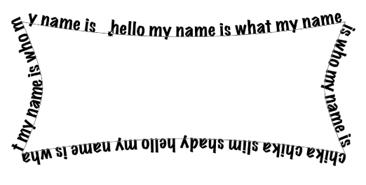
You can use the direct selection tool (a) to adjust how it follows the path. Use the character panel to affect the tracking and such to make it fit better.
To add text inside of a path, click the text cursor inside of it.

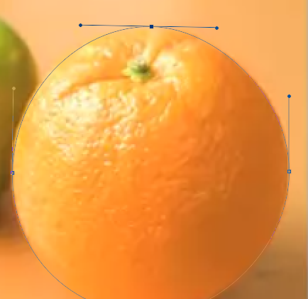
Vector Shapes
Using Vector Shapes
The vector shape tools are the third group on the lefthand toolbar. They are the pen tool, type tool, direct selection tool and shape tool. There are a bunch of shape options.

In the options bar you can chose whether you want to make a vector shape, a working path or a rasterized pixel shape.

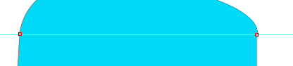
To create a shape, either click on the canvas and it will ask you to define its dimensions, or click and drag. Holding shift while drawing it will keep its aspect ratio. The thin line is the path, a line only visible when the shape is selected. The anchors are the dots with handles on the end for adjusting the shape.

To show/hide paths and anchors, use Command + Shift + H. You can adjust the fill and stroke outline/width in the options bar. You can then choose whether the stroke is dotted, dashed, etc.
The button after the dimensions affects what happen when you go to draw a new shape, like create a new layer.
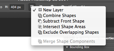

You can combine them, or subtract them which makes the new shape act as a mask. Intersect makes it so that is where the mask is. The exclude option hides the parts that overlap.


You can manipulate them individually with the direct selection tool (a).
To merge them all into one, select Merge Shape Components.

If you select the custom shape tool, then the shape option in the tool bar > gear, you can see some preset shape options.
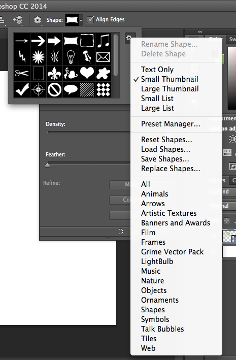
If you choose one, it will ask you to append or ok the new shapes. Append will add them to the shapes in the box now, while ok will remove those and just add the ones you’ve just selected.
Pixel Snapping and Hinting
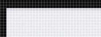
Start by making sure you have pixel grid turned on under View > Show > Pixel Grid. This grid only appears once you’ve zoomed in past 600%. It gives you an idea of where your vector shapes are in relation to photoshops pixel grid. Even though vectors are made of paths, not pixels, this still affects how it looks.
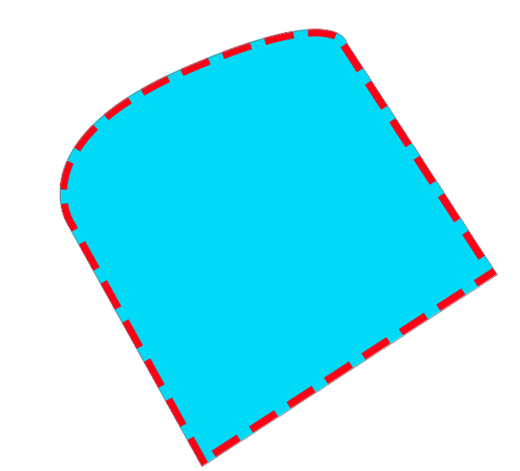
Here we have a icon, that’s showing some signs of anti aliasing. This is often apparent on vertical and horizontal lines. You can fix this with the Align Edges option, under the options for the shape toolbar.


Still, this tool isn’t perfect, we can still see some unwanted aliasing at the bottom. They’re appearing gray because it’s supposed to be half a pixel.

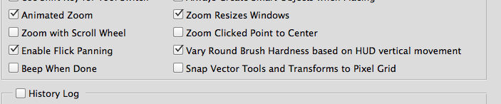
To fix this, use the direct selection tool (a) and select the start and end anchors for the grey ones on the top. You can then move it, but it moves it a whole pixel and we need it to be half a pixel. To do this, we need to turn off pixel snapping by going to menu > Photoshop > Preferences > General > Uncheck Snap Vector tools and transforms to vector grid.
You can now move the path how you like. The closer you’re zoomed in, the more control you have. This process is called pixel hunting.
Be careful when adjusting the path of curved or diagonal lines, as these should and will have anti aliasing. End product:

Custom Shapes with the Pen Tool
Select the Pen Tool (p) from the toolbar, and you’ll see there are a few options.

Like the shape tool, we can choose whether we want to draw a shape or a path (in this case we’ll do a shape), and the fill. On the canvas, your cursor will turn into a pen with a *, letting you know you’re creating a brand new path. Every time you click it will create a new anchor, and make a path between that and the previous anchor. You should try to use as few anchors as possible – fewer points = smoother curves. To create a curved edge, click and then hold to show the bezier handles, which you can then move around. The longer the panels, the more of a curve you’ll get.

If you need to move around the canvas while drawing, hold space bar and you can use the hand tool.
If you have rulers enabled (View > Rulers), you can add guides to help make sure you’re making symmetrical shapes by dragging down on the rulers. You can hide/show these with Command + ;.To make a straight line, hold Shift and click.
When you’re done with your shape, hover over the first anchor point and you’ll see the pen with a little white dot. This is to close the path, and must be done to complete the path. You can now make a new path.

To clean up a path, use the direct selection tool (a). Click on the path to reveal its anchors, then adjust them like we did before. You can move anchors by clicking on them and dragging or nudge them with the keyboard arrows.
The Add Anchor Point Tool (a) under Pen tools lets you add a new anchor by clicking anywhere on a path, and the Delete Anchor Tool lets you remove them. The Convert Point Tool can be used for a curve you’re not happy with to evenly distribute curves on either side of an anchor. Holding shift makes it more even.

Once you’re done, you can transform your image with the transform tool (Command+T), add strokes, etc.
To save this shape for later use, select the Pen Tool (p), right click on it > Define Custom Shape and give it a name. It will now be selectable in the custom shapes option.

The pen tool can also be useful when tracing the paths of things for masks. Simply draw the path with the pen tool, then right click > Make Selection, then apply a layer mask.
Slices and Saving for Web
Introduction to Slicing
Slicing up a PSD means you’re literally cutting up and optimizing all the graphics and images the developer will need to turn it into a website. We’ll use the Slice tool (c), located under the Crop Tool.

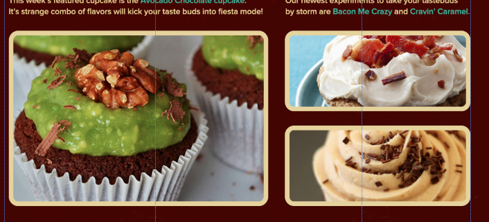
We’ll be slicing up this site. Things we’ll need to slice include things like the logo, graphical/normal images, buttons, social media icons, the background texture, etc.

Some of these can just be done in code though, like with border-radius for rounded buttons. You need to slice only what can’t be done with HTML and CSS.
The Slice Tool
Use the Slice Tool (c) and make a bounding box around the logo as close as you can get without cutting it off. You can adjust it after as needed.
Next, right click on the Slice > Edit Slice Options. Here, you can name it. By default it’s the name of the PS file followed by the slice number. This is awful for the developer though, so give it a meaningful name.

Let’s keep on slicing.

For the pictures, we can replicate the stroke with a border, so just slice the image itself. If you need a second slice that’s the same size, simply hold shift and drag on it to duplicate it.
For backgrounds it may be easier to copy just that to a new file.
Optimization: Part 1
If each image hasn’t been optimized, this can seriously affect page load times as the images will likely be way larger than they need to be.
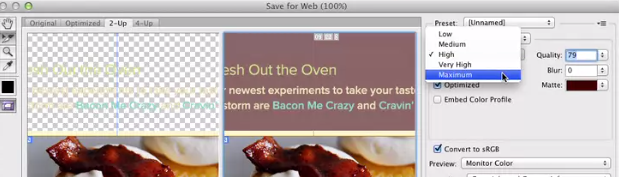
We’ll start with the background she made. Don’t go to File > Save As, as that doesn’t let you control the quality. Instead, go to File > Save for Web.

The main area is the preview window so you can see the effects of your changes. Above that, with the tabs you can choose whether to see the original, the optimized version, or 2 up, which shows them side by side. You can use the tools on the left to zoom in and move around, to help you see what’s changed versus the original. Remember, the goal is to keep the quality the same with the file size as small as possible. Below the images you can see the file size and things being applied to it, like dither.
On the right you have your compression options, which change depending on the file type you’ve chosen.

Additional notes:
Gifs/PNG-8 are good for compressing solid-color images and ones with areas of repetitive color. It uses 256 colors and supports transparency. They’re typically smaller due to the reduced color palette, unless they’re being used for animation.
JPEGS were designed to preserve a large color range, retain all color info, and can be compressed by discarding data.
PNG-24 (Portable Network Graphics) has great color too and can handle effects and transparency better than Gifs, though there is a lack of transparency support in older browsers. It also compresses better, often 5-25% so.
Lossless data compressions means you can compress without any loss of quality or information, while lossy may result in that.

Since our background has few colors, we can save it as a Gif. You can select less colors to make the image smaller. The Lossy control adjusts the amount of lossiness allowed. Increasing the number reduces the color info but greatly reduces the file size.

Optimization: Part 2
Now to save the rest of the images. First, hide any background layers so our other slices have a transparent background. Then, do File > Save for Web.

In the preview window, the PSD is faded out, and the slices are more saturated, to show you which ones you’re applying settings to. Use the slice select tool on the left to select the one you want to work on.

It helps to zoom in for the comparison. Since the logo has few colors and a transparent background, we’ll go with a PNG-8. We’ll add a matte for the background, which fills in the semi-transparent pixels around the graphic’s perimeter with the same color as the background image to make things look more smooth. If you need true transparency and smoother edges though, PNG-24 is better. We’ll reduce the color palette as well. Once you’re happy with it, simply move on to the next slice with the Slice selector tool.
For the actual images, save these as JPEG’s and choose the quality you want for your image/amount of compression. Low is a lot of compression, with less quality. You can also manually change the number for quality on the right.
Lastly we have the social media icons, which you can select together by holding shift and clicking each. Since they’re simple, we’ll go with PNG-8 again, limit the colors used and add a matte.
Once you’re done, to save them out click Save at the bottom. If you leave it set to All Slices, it will save not just what was sliced but everything around that, so choose User Slices to save just what was sliced.

They’ll all then be saved where specified.

Workflow Basics
Managing Photoshop Documents
For a new project, make one folder to work out of, labeled by client. Within that, create the Project folder.


Use meaningful names, avoid doing things like adding numbers or using “newest/oldest”.
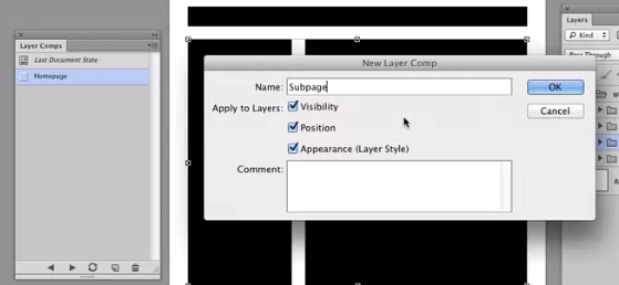
If you’re designing a web site with different pages that use the same design, use Layer Comps, which let’s you create an save multiple versions of a design in a single master file in Photoshop. You can save new comps and choose which to view in the Layer Comp panel.
Becoming Non-Destructive
For images, avoid permanently resizing or altering images from their original state as much as possible, as pixel data can be lost. Instead, be sure to convert them to smart objects first by right clicking > Convert to Smart Object. This ensures the image’s original size remains intact.
For vector images, instead of adding them view File > Open, which rasterizes them, copy and paste them in from another vector editing software, and choose smart object from the prompt. This means they retain their scalable properties, and you can edit them in illustrator and they will auto update where you used them in photoshop.
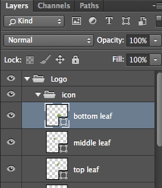
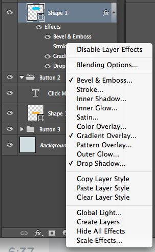
Convert groups of layers into a smart object to create reusable components and clean up your psd. Shift and click the ones you one, then right click > Convert to Smart Object. Do this for everything that’s used more than once. Remember, if you change the original, all the others used will auto update as well, which is easier than having to go change all of them.
For type, avoid rasterizes, as that means you won’t be able to edit it anymore. Convert it to a smart object instead.
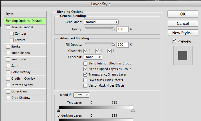
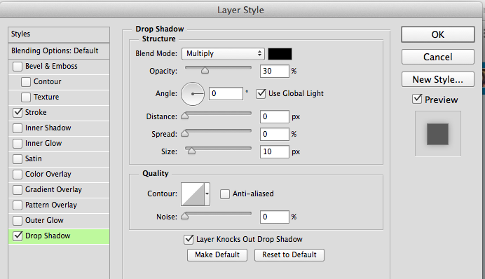
Use adjustment layers for layer effects, as this will put them separate from the layer and let’s you easily hide, show and remove the adjustment.
Time Management
Under Photoshop > Preferences > Performance, you can set how many history states it will remember, which greatly affects performance. The cache levels should be set lower if you don’t have a lot of RAM. Note how much memory you’re letting PS use as well.
Learn the keyboard shortcuts as they will save you a lot of time over time. This is a helpful guide.
PS Actions are a recording of a sequence of actions that you can save for later. There are resource sites you can download these from, or you can create your own by having it record what you’re doing. To access and use them, go to Window > Actions.
Track your time, to see what little things you do that add up and take up time, like checking your email and social media. There are time tracking apps for browsers to help with this.