Introduction to Front-End Frameworks
What is a Front-End Framework?
A tool for building websites that help you get started and streamline your process. They’re good for getting an idea out quickly. Building a site from scratch takes time due to testing to ensure things work on multiple browsers and viewports. Frameworks take care of a lot of that for you. Most sites are responsive and have a similar structure/layout. Rather than reinventing the wheel, you can use a framework. They’re basically a library of components we can easily reference and use when building a site.
There are two types: simple and complete. Simple are usually lightweight and used for specific features like typography, a fluid grid layout and css resets. Complete ones are more robust and have a complete set of tools for the whole project.
They use many best practices, the code is DRY, maintainable and scalable. They also have excellent documentation.
Should We Use a Framework?
They should be used to save time and speed up workflow, but NOT as a crutch if you don’t understand html, css, js, etc. First, ask why you need it? Do you just need a fluid grid layout, or something more? How much time do you have? What’s your budget? Are there technical/creative limitations? If you have no time, budget and skills, it may be a good choice. You should choose on based on those things, and what’s needed for the project. If you’re on a team, using a framework can make things easier for everyone to maintain things.
Prototyping with Bootstrap
Introduction to Bootstrap
Bootstrap is an evolving framework with a complete set of well defined html, css, js and font files. It powers over 1% of the web. It was built from the ground up by twitter to help with front-end inconsistencies. It’s one of the most complete frameworks, using modern web technologies like grid layout and responsive design. It comes with cross browser compatibility, though it works best in the latest browsers though. It’s built with the Less CSS preprocessors, so it takes advantage of things like variables, nesting, etc. It has good jquery plug ins as well.
Downloading Bootstrap
Download it here, and it will include the minified CSS and JS files. You can also clone/fork it off of github. You can also install and manage the files with Bower, a package manager for the web. If you have BS downloaded and Bower installed, just run the command “bower install bootstrap”. Or, rather than downloading, you can just link to Bootstrap’s CDN. The downside to this is that you need to be connected to the internet to use it.
When you download BS, you’ll get both the normal and minified versions of the css and js files. You can tell which ones were minified because they’ll have .min in the name. There is a font directory for the fonts you’d want to use as well.

It also contains a bootstrap theme css file for option you can link to for optional theming.
Building a Header, Navigation, and Jumbotron Component
When developing with BS, keep the documentation handy, which is available on their site in different sections. It contains examples and references to help you get started building.
We’ll start with some HTML that doesn’t have any styling applied besides normalize.css, which bootstrap uses. We’re currently linked only to the min.css file.


We’ll start by adding a container to our page. To do this, simply add the the bootstrap class .container to the main div container element. This let’s us easily center the pages content, and auto sets the containers max width at every media query breakpoint.


Next, we’ll style the header and nav links. We’ll use the page-header class component here, which will space up the header element for us. Looks like it add a bottom border for us as well.

For the nav links, we’ll use the nav component on the ul containing our links. It spaces them out, removes the list style, and adds a nice gray hover state.


We can now add modifier classes to create different types of navigation. First we’ll try the nav-tabs class, which gives a nice, horizontal nav.


nav-pills gives us pill shaped nav links.

To adjust the position of these links, we need to use one of bootstrap’s helper classes. Here we’ll use the .pull-right class to float the items right.


Use the active class to style the link for the page you’re on.


Next we want to style the most important part of this site, the main content text and call out links. For this, we can use the jumbotron component. It’s used to showcase important content. Give the div wrapping this content the class jumbotron. Then, use the lead class for the lead text, which will make it stand out, and also prevent it from appearing too big in smaller viewports.

Now let’s style the callout links using bootstrap’s button classes. You start with the base style btn, then add a modifier class for the button look you want. We’ll use btn-success to make the first one green, and btn-default to make the second one white. We’ll adjust their sizes with a button size class, in this case the btn-lg one.

We’ll then use one of the button group classes to put them together on the same line. First, we must put the btn-group class in the containing p element.


That was awesome. This is fully responsive too over 4 breakpoints.
Using the Grid System
Bootstrap’s grid system is mobile first and responsive. It has four tiers, phones, tablets, desktop and large desktop.
The site has had some features added as content.

The grid consists of two important parts – rows and columns. Columns always need to be nested inside of a row. The grid can scale up to 12 columns depending on the viewport width. Here we want to layout three columns horizontally in one row. First, define the row with the class row in the containing div element. Next, add column classes to the child divs. There are multiple options here for how they should display on different breakpoints/devices. Simply divide the number of columns you want(3) by the total allowed (12), to get the number you need, in this case 4. There are four options for the different breakpoints, we’ll start with the smallest one col-xs for each div. Since it’s mobile first, this will apply to the larger breakpoints as well.


The col-sm is for small devices like tablets, and using them here will make the columns appear stacked in the extra small phone breakpoint. In the small range, they’ll switch back to the three columns.


If we were to use the medium col-md class, they would stack with the xs and sm class breakpoints. If we use the col-lg prefix, the columns will stacked in every device range but the largest one. Here though, the col-sm option works the best so we’ll stick with that.
Working with Nested Grids and Responsive Images
Once again, we have some new content to style. We’ll start by giving their container the class row. For the two child divs, we’ll make one the width of 8 columns and the other the width of 4 to hit our 12 total.


That’s a little big for the amount of text though, let’s make them both 4.

It would probably look better if one was on the left and the other was on the right though, so we can use an offset class to do that. Simply add the col-sm-offset-4 class to the second div.


But now we have this big 4 col gap, so let’s just make our two columns equal in width.

To nest rows inside of columns, we’ll need to another row of content, which will display a thumbnail of the tutorial and how to sign up. We’ll put a new div with some content within our div for the left column, and give it the class row. When rows are nested, you can still give columns the same grid classes as before, the difference is that the columns will scale according to the width of the column it’s within. So, for our columns here we’ll set each to col-sm-6.


It looks like our second column with the text sized correctly, but not the image. This is because the image itself is 450px wide, which is bigger than our column. To fix this, we can give the img a class of img-responsive. It applies a max-width of 100% and a height of auto, so the widest the image can be is the width of its containing element.


You can change the order of the columns with the col-push and pull modifier classes. Let’s say we want to reverse these to for only md and lg devices.


On mobile designs, sometimes you don’t want all the content you have on the desktop version. Bootstrap offers classes to let you hide or show things based on the device size.

Here, we’ll use the hidden-xs class to hide the left column on xs devices.

Building a Fixed Navbar
Here we’ll be linking to the bootstrap-theme file, to take advantage of some of its features. At some point we’ll need to add our own files as well, but when you do be sure to avoid editing bootstrap’s default css files, and add them via your own stylesheet. We’ve also linked to jquery and the bootstrap js file at the bottom of our document.

Now to make a fixed navbar. We’ll start by putting a div outside of our containing div, because remember that’s a wrapper and won’t let content within it span the entire length of the viewport. We’ll give it the classes navbar and navbar-default. Inside that we’ll add another div with the class container.

Now to add the nav elements. We’ll start with a link for our branding, and give it the class navbar-brand, which bootstrap uses to place it over to the left, and give it the class text-muted so it doesn’t stand out too much. We’ll then add our collapsing nav with a div and the classes collapse and navbar-collapse. We’ll then add our links with the ul from before, removing the pull-right and nav-pill classes, adding the navbar-nav, which positions the links horizontally and gives them their default color styles. Then, navbar-right, which will float them to the right.


We can invert the colors by changing the navbar-default class to navbar-inverse.


Now to make the navbar fixed at the top by adding the class navbar-fixed-top.

However, the fixed positioning here causes the navbar to overlay the content. To fix this, we can add our own padding via our own style sheet.

Now, those nav links disappear in xs devices, which is good, but we want to have a button appear there instead. We’ll start by adding some html for a button.

The navbar-toggle class on the button positions the toggle button on the right side of the nav bar in mobile views. The collapse value for the data-toggle attribute calls the javascript for the collapse functions and plug ings. The data-target makes the nav toggle on and off when clicked. The span elements make the collapsed menu bars.

Last thing to do is reset the max width of our container. Currently it’s set at 1170px, which is too wide, so we’ll adjust that in our own stylesheet.


Build a Website with Bootstrap
Adding a Dropdown Menu and Glyphicons
Bootstrap uses the dropdown.js plugin to make this happen. First weapply the dropdown class to the parent element of the link we want to trigger the dropdown. Next we’ll add a data-toggle attribute to the link with the value dropdown. Also, replace its href with a data-target attribute, set to #. This keeps the urls intact, letting us use the link as a trigger rather than having it link to a page. To indicate that the link will open a dropdown, will add a b element with the class caret.


Now to make the list of links in the dropdown. Add this right beneath the trigger link, and add the dropdown-menu class to the ul tag.

To add dividers, just add a li with the class divider.

This is also responsive.

Next we’ll add a contextual icon over each column paragraph of content, using our glyphicon font files, which contain 180 glyphs to choose from. Simply add the glyphicon class to a b element, then the class of the one you want.


To resize them, we’ll go into our mystyles.css file, select .glyphicon and increase the font-size to 3em, display block, text-align center, and set the color to a blue.

Building a Carousel
Bootstrap’s carousel component lets you cycle through pictures. To add it, put it outside of the first container div, so it takes up the full width of the page. Make a div and give an id of your choosing. Then, give it a class of carousel, and slide, which will slide the pics from left to right, and jumbotron, which will maintain headings and text size. Then, add in a container div. Inside that, add a div with the class carousel-inner, which positions the slides and sets the overflow. Inside that, add the first slide aka item, as a div with the class item.

We’ll now paste our header and p content into our first slide, since this carousel is replacing the previous jumbotron. Then, we’ll add the active class to our first item, so it displays.

To remove the space between our slide and the header, simply adjust the body’s padding-top under mystyles.css.

Let’s add more slides.

To actually see them though, we need to add anchor elements with spans for the arrows. Set the href to the id you gave the original div. Give it a data-slide attribute set to prev, and give the span a icon-prev. For the right arrow simply switch left for right, and prev to next. Note: you add this at the end of the carousel div after the slide items.

Finally, we’ll add those navigation dots with an ordered list. Give it the class carousel-indicators to the ol, and in the li add the data-target attribute and set it to the id you created earlier, and the data-slide-to attribute set to the index of the slide you want. Finally, add the active class to the first li.


So to style those better, adjust the style and position with our own custom styles.

Building Modal Windows and Forms
The modal.js plugin lets you add modals. Here, we’ll make it so when you type text me the link, a modal pops up with a form that lets you enter your number. First make a div with the class modal, and also fade, which will make it slide down and fade from the top of the page. Then, give it an id of your choosing. Inside that, create a div with the class modal-dialog, which will keep our class centered on the page. Inside that, a div with the class modal-content, which gives the borders, box shadow and border radius. Then, a div with the class modal-header, and another with the class modal-body.

In the header, we’ll add a button to close it and some text. The close class styles and positions the close button in the top right and data-dismiss=modal closes the window when the button is clicked.


Next, to add the form. In the body, add a form element with the class form. Inside that a div, with the class form-group, which applies the spacing to labels and form elements. Next, create the label with the class sr-only, which hides the class from us, but screen readers can still read it. Then, an input with the form-control class which makes the input receives the global styling and sets the width to 100%, and a placeholder. Make another form-group field, inside that a select element with the class form-control and the options for iOS or android. Lastly, add a button element for the submit button, with some button classes. The data-dismiss attribute=modal will close the modal when this is clicked.

Currently the form fields are displaying block, so they take up 100% of their parent’s width. To change that, set the form element’s class to form-inline. Note that they will still display block on smaller devices.


Build a Website with Bootstrap
Customizing Bootstrap
You can customize bootstrap for your needs, choosing your LESS components and variables and jQuery plugins. The variables let you preset things like colors and the container sizes and navbar height, which makes them easy to use later. The defaults are written in grey as placeholder text. When you’re done, scroll to the bottom and click Compile and Download.

 Note that in your header your should put this for IE8.

Building the Navbar
First define the containing div as a navbar with that class, and then the navbar-default class for the default navbar files. Then, add a container div to make sure that the element stay within a fixed width. To make it fixed, simply add the class navbar-fixed-top to the main div. For our logo, give it the class main-logo (note this isn’t a bootstrap class, but a custom one we’ll use), and for the text, navbar-text. Float them left and right with the pull-left and pull-right classes. We’ll add hidden-xs to the text to hide it on small devices.

Now for custom styles, remove margins for the navbar-text and make it bold, and for the logo, use the trick where we indent the text a ridiculous amount so it doesn’t appear, and instead use a background image for it.


Building the Hero aka Jumbotron Component
Give the first div the class jumbotron, then, wrap it’s content in a container class div. Then, create a row div and some container columns, spanning 6 columns each from small upwards with col-sm-6. Note that in xs devices they will be stacked instead because of this. Make one for the image, giving it the custom class device so we can style it later, and add the class hidden-xs so it’s hidden in extra small viewports. We also give the p tags a class of .lead, Then for custom styles, we’ll give the jumbotron a custom bg image, some padding and margin-bottom. Then, style the device class image. Then, style the h1 and .lead text.


Adding Button Styles and Media Queries
Now, we’ll style the buttons by giving them first the btn class then btn-default for the default styles we set up earlier and then also btn-lg to set the size. We’ll add some custom button styles as well, increasing the border width and changing the color, and also some hover styles, changing the background-color.


Now, we’ll add media queries, starting with anything =< 991px. We’ll change the padding for the jumbotron and position of its bg image. Next, we’ll do one for =< 767px, reducing the height of the navbar and size of the logo, and more padding changes for the jumbotron.


Content Layout with Grids
Start by adding a container div, then give each div inside the class row, and ft, a custom style. Then, create the columns in the rows with divs with the class col-sm-6, and one with another custom class ft-copy, for the feature copy. For the second column containing the image, we’ll add the hidden-xs class to hide it on small devices. Inside that we’ll make a div for the image, with the custom class ft-icon, and the camera class since this one will be a camera.

Now, we’ll make custom styles for the ft-icon div, setting it’s dimensions and bg color and image. Then, we’ll adjust the background position for the bg image for the different divs to make them look more interesting.

To change the layout, simply rearrange the markup.

Adding the Feature Icons
Now, to add the three icons for this section, which are currently all in a sprite sheet.

We’ll add these with the :before pseudo element, with an empty content, display block, absolute positioning (which is why we set the ft-icon div to relative), a width and height, then center it by setting top, bottom, right, left to 0, and margin to auto. Then, add the sprite sheet with a bg image.


To get the right icon for each, we’ll just adjust the background position.

We’ll use the img-rounded class on the div to round the images, and add some custom styles on ft-icon for margin-bottom and padding for pt-copy.


Building the Form and Button Panel
We’ll tweak the media queries for the padding of pt-copy and margin-bottom of the pt section. For the panel, we just add the panel class to our div, and panel-default for the default panel styling, and the hidden-xs class to hide it on xs devices. Next, we’ll make a row div with two columns divs, each taking up half the row. For the input, once again we’ll use the sr-only class to hide the label from us, but not screen readers. For the text input we’ll give it the class form-control, which brings in global styling and width for form elements, and a custom class phone-txt. For the button we give it the button class, and a custom class button submit.
For the button we want it to be an arrow, so we’ll use bootstraps glyphs, by making a span inside the button with the class glyphicon and then the class of the glyph we want. We’ll then offset the first column to make it closer and line up better with col-offset-1.


Now for custom styles for the panel, starting with the rainbow background image and have it repeat on the x axis only. Then, a border-bottom and some padding and margins.


Adding Icon Fonts with IcoMoon
Now to add the iOS and Android icons to their buttons. Bootstrap doesn’t provide these, so we’ll use IcoMoon. Click App > Start the App > click the ones you want > click Generate Font at the bottom > Download.

Once they’ve downloaded, put them in your fonts folder in the project. Then, import them using the @font-face rule, which IcoMoon actually gives you with your download.

To insert them, you can use the data-icon attribute in the elements you want them to appear in. For the value, they give you the unicode value needed. Then, you’ll need to use a pseudo element to actually get them to appear, which is easily done with an attribute selector. Bring in the font-family from the @font-face we added, then set the content to be the value of the attribute data-icon, set a font-weight/variant/transform, line-height and margin


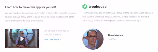
Content Layout with Nested Grids
First we’ll split our row into two columns, each taking up half the space with col-sm-6 Within those, we’ll make a new row and columns for our image/call to action. We’ll add the bootstrap img-responsive class to make sure the image has a max-width of 100%, and also img-rounded for some border-radius.


We’ll now layout the next column the pretty much same way, though with dif size and a img-circle for the image.


Adding Responsive Classes
Now we’ll style it for the xs devices, since a lot of things were excluded for it, like with the use of col-sm-6. We’ll start by hiding some of the teacher content from before with hidden-xs. We’ll add a custom th-copy class to the copy in the features section.

Now to style the callout button. Give it the btn class, btn-success for those styles, and btn-lg to make it large, then some custom styling.

Adding the Video Modal and Footer
Now we’ll build a video modal for when you click the video image. First, add the markup for it. Most of the classes here were explained earlier for the modal lesson, but we did need to add an id so we could link to it.

The link requires some custom attributes, like data-toggle=”modal”, and href set to the id.


Now, to do the footer, which is already set up with rows and columns, including some offsets and custom classes. For the div containing the footer we gave it a custom class main-footer, which we apply some margins to.


 This ends up putting everything in quotes though, which we don’t want. Luckily we can use the unquote() function to fix that.


 Kyle's Awesome Awful Websites