Transitions and Transforms
Transitions are a new CSS feature that allow you to change a property from one value to another over a given duration. You can also control the start time and speed of the duration. This is actually very well supported by all modern browsers. The syntax is pretty straightforward, you only need to specify the property you’d like to transition, its duration, and a transition timing function or delay.
NOTE: Not every CSS property can accept transitions. The w3c has a list of the ones you can use.
One of the simplest ways a property can be transitioned is with a pseudo-class like :hover. The transition-property value let you choose which property you’d like to transition.
However, if you just did that, it would look like a normal hover state where you’d hover and the color would change. The transition-duration property defines the length-time or duration of a transition. The default value for it is 0s (seconds). To specify the duration in milliseconds, simply put a period before the number. So, .3s would be 3 milliseconds.
transition-property does allow multiple transitions to be defined, using a comma separated list of properties. Additionally, if you want a different transition-duration value for the second property, you just list that after a comma as well. In the example below, you can see border-radius takes longer to change.
Rather than writing out every property, you can just set transition-property to all, which will animate all animatable properties within the rule. This is actually the default value for transition-property, so you don’t need to include it if you want to animate all animatable properties.
When you unhover, the properties snap back to their original state. To have them transition back to their original state the same way, you’ll have to add the same transition declarations to the original rule.
If you want the transition values to be the same for both states, you only need to include them in the initial rule.
They also recommend you include the vendor prefixed properties for older versions of browsers, but the only one I can see needing in the chart is for older versions of iOS and the current version of Blackberry mobile, which would both be -webkit-
There are additional properties for easing and delaying transitions. Notice in the example below how they use a descendent selector, basically saying when you hover over the .wrap class, select the descendants with the class “box”.
The speed of a transition can vary during its duration. It actually follows an acceleration curve. This article explains this more and breaks down the pre-determined timing functions. The transition-timing-function property lets you establish an accelerated curve, which determine what happens between the beginning and end of a transition. There are 8 predefined timing functions.
- ease is the default value, and starts gently then speeds up (it’s the one you see above)
- linear gives it a constant speed with no easing

- ease-in starts slow, then speeds up towards the end

- ease-out starts at a constant speed and then slows down at the end

- ease-in-out starts slow, speeds up, then slows down again
- step-start, step-end and steps() let you define the number of steps for the transition. So, steps(4,end) would mean it transitions in 4 steps until it ends.


These are all mapped to cubic-bezier (bez eee ay) values, which you can use to build your own acceleration curves. It’s a mathematical function that provides a smooth curve that accelerates or decelerates. It’s defined by four control points, P0 to P3. P0 and P3 are always in the same spot, 0,0 and 1,1 respectively. P1 and P2 provide the directional info on how the curve starts and ends, and are what we set.
The cubic-bezier() function can be used for the transition-timing-function property for setting the values for P1 and P2, which are each specified by an x and y value. The x values need to be from 0 to 1, but the y values can break outside that range by using a negative value. In the example below, we’ve made it quickly eases out and slowly settles in.
 By using negative values in our y values, it will actually break out of its wrap element and will ease back into its starting and end positions.
 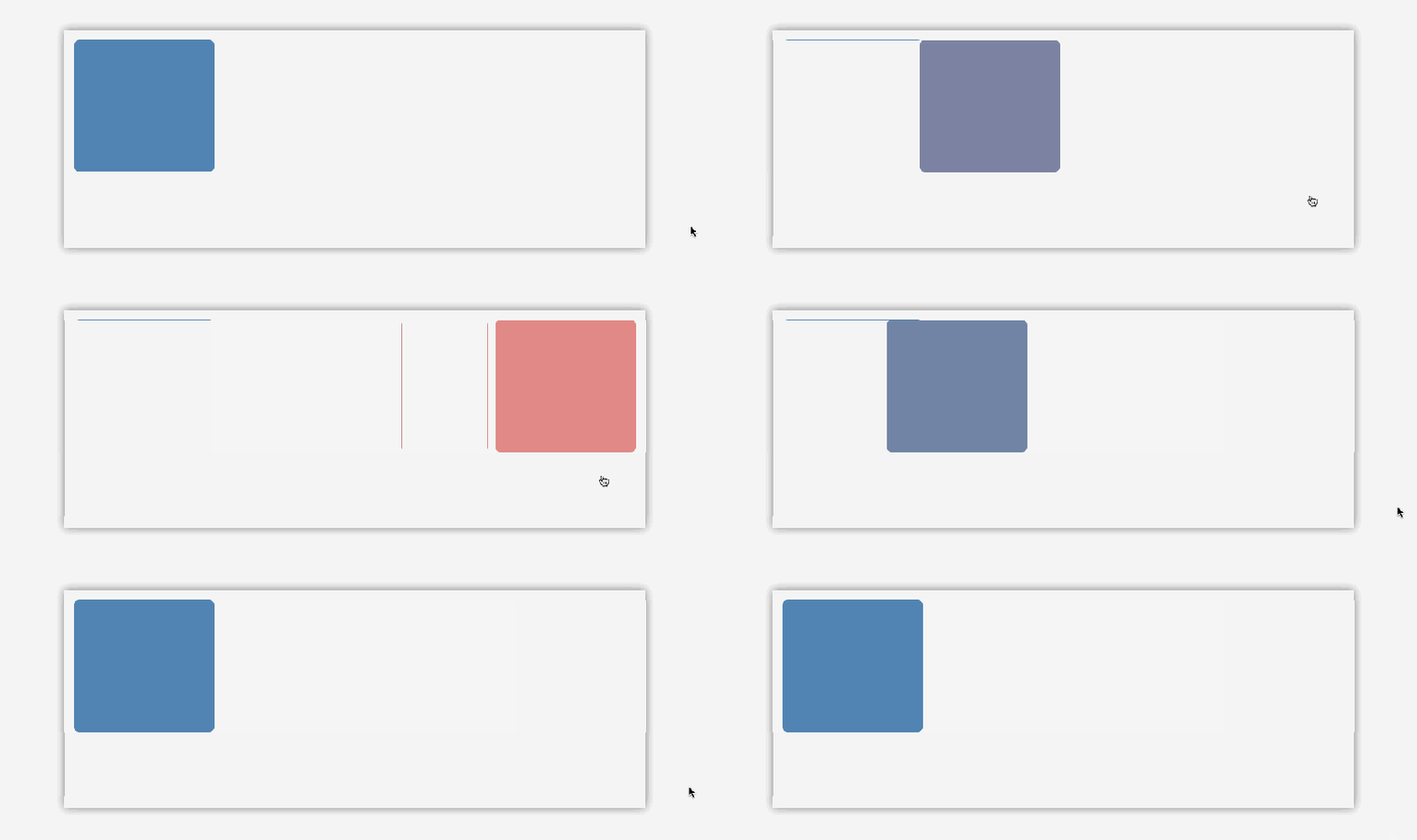 You can also create a delay that happens before the transition begins using the transition-delay property. Notice how it delays the transition both ways. It actually wouldn’t do the second transition until you stop hovering.

 You can set the transition properties individually, using the transition-property property and the comma separated values shown before. Notice how background now takes much longer to change, due to it’s 1 second delay value.

 You can use the transition shorthand property to write all of those in one declaration. The order is important because the second value declared will always be considered the transition delay. So the first value is the duration and the second value is the delay.
Resources: There are tools to help you make these curves. http://cubic-bezier.com/#.17,.67,.83,.67 is a simple app for creating, testing and comparing testing functions, and does not restrict things to the 0-1 range, so it lets you create those bouncing effects. You can then export the CSS for it into your stylesheet. http://matthewlein.com/ceaser/ is another one that you can use to make code snippets.
If a browser does not support transitions, then it will simply apply the value instantly with no transition. This is okay, as transitions should be used as an enhancement feature, the content and functionality should not depend on them.
CSS transforms provide a way to move, skew, rotate and scale elements in a 2D or 3D space. 2D transforms have excellent support in modern browsers, though chrome and safari still require the -webkit- prefix.
The transform property lets you do this. The rotate() function can be set as a value for it, and accepts arguments and various types of angle units. The deg unit moves the element in a circular motion up to 360 degrees. Positive values rotate it clockwise and negative values counterclockwise. So, 45 degrees would turn it halfway to the left. In the examples below, there’s a clear version of the picture set behind it to show the difference.
Other units you can use are grad for gradients. 400grad is equivalent to one full circle or rotation, so 360 degrees, and 200grad would be equal to 180 degrees. You can also use rad for radians. 1rad is equal to about 57 degrees. 3.14rad, aka Pi, is equal to 180 degrees, and one full circle is 2Pi rad, or 6.28rad. These are a little more complex, so you can use turn for a more intuitive angle unit. 1turn is a full rotation, aka 360 degrees, .5turn is a half rotation, aka 180 degrees.
These work well when you combine them with transitions.

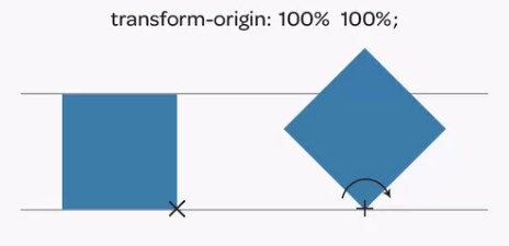
The transform-origin property lets you define the origin of the transform. Its default value is 50% 50%, which places the origin in the center of an element, so it rotates like the example above. You can move the x and y origins with these two values, the first for x and the second for y. y is 0% at the top and 100% at the bottom.
You can also use position keywords for this like top, right, bottom or left (so: top, right would be the same as 100% 0%)
Setting it to 100% 100% gives you this:

 The scaleX() function is another value you can use, and will scale the image horizontally on the x axis. It accepts numbers, so 1.5 would be 150 times its size on the x axis.
scaleY() works the same way, only the scaling is on the y axis. Note: for these the X and Y are capitalized.

 To scale X and Y at the same time, you can just write scale(). If you write one argument, it will apply to both x and y.
The skew() function gives it a slanted or twisted appearance, and accepts degrees and the other circle measurements from before as values. Once again, there is skewX(), skewY() and skew() for both (you would enter x and y as two comma separated values, if you don’t write a second value for Y, it’s assumed to be 0). So, scaleX(45deg) skews it to the left on the x axis, and -45deg would skew it to the right.
The translate() function lets you move elements along on the page. It accepts any length unit or percentage in its argument. translateX() moves it left to right, translateY() moves it up and down, and translate() is for both (which once again uses comma separated values for x and y, and if you don’t write a second value for Y, it’s assumed to be 0). A positive x value moves it to the right, and a negative x value moves it to the left. A positive y value moves it down and a negative one moves it up. You can also use percentages. 100% would move it by 100% of the element’s size. So if it was 150px, it would move it by that much, etc.
You could instead use the top, left, bottom and right positioning offsets, but the translate function is much better performance wise, because 2D and 3D transforms happen on the GPU. So, they’re hardware accelerated, which leads to smoother animations.


 You can combine transform functions to make cool effects. Here, we combine scale and rotate:
3D transforms are an extension of 2D transforms, and introduce the z-axis allowing us to use the properties in 3D perspective we establish on the page. The elements are still 2D, it’s just no longer stuck on the 2D plane. A lot of the properties here we’ve seen before for 2D transforms.
In the example below, we start with two divs, each with a background image. 
If we want the bottom one to go behind the first, we can just give them both a position:absolute, which IIRC removes them from the normal document flow. Now, if you were to just do that the bottom image would be on top, so you give the first a higher z-index.
Before you can do a 3D transform, you must establish a 3D perspective for the page, or it will still appear as a 2D transformation. The perspective property lets you do this, and the element that you define it for will affect its direct child elements only. They did this for the body, which I’m confused by because its direct child is just the div with the class wrap, and not the divs with the pictures.
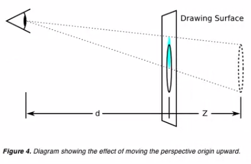
The value you set for the perspective property is the distance from the drawing surface to the assumed surface of the viewers eye, and is comparable to the field viewing angle of a camera. The smaller the perspective value is, the deeper the perspective is, and the larger the value, the shallower it becomes. I’m really quite confused by that. 800-1000px is a normal value for this though.
Next we’ll add the transform property for the hover state to tell it what we want it to do when someone hovers. To make the transition smooth both ways, in the rule for the non hover state we’ll add the transition shorthand property to specify its length and timing-function (the ease-in part of it). Notice how it rotates on the x axis within a 3D plane.
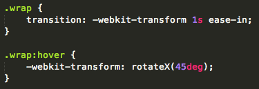
 A negative value of -45deg rotates it the other direction.
 If you mess with the -webkit-perspective properties values you can see a big difference. When you make the value smaller, the perspective gets deeper, and if you make it bigger, the perspective gets shallow.
rotateY() does what you’d expect, rotates it on the y axis.
rotateZ() rotates it on the Z axis. The way to think about how it will rotate it on each axis would be like the element is a postcard and the axis is a piece of string going through it. If so, how would it turn if it were pierced by it? So, 65deg would turn it to the right, and -65deg would turn it to the left.
You can rotate on all three axis using one argument with the rotate3d() function. It accepts 4 values. The first three set the direction of x,y and z, and the last one sets the rotation. x,y and z are always number values, usually zero or 1. If it’s set to 1, it will rotate by the value specified, and if it’s set to zero it will not. So in the example below, it will rotate on the x and y axis, but not on z. In the second example, it only rotates on x and z.
The perspective-origin property allows you to set the viewing position or origin, which by default is the viewport. Like perspective, it needs to be defined on a parent or root element in order to give the transformed children depth. It lets you move the perspective up, down, left, right, etc.
By default, the origin is centered on the viewer, equivalent to the value 50% 50%, setting the x and y position in the center. It takes two values, the first for x and the second for y. It can accept length units, percentages, or keywords left, center, right, top, and bottom. If you only define one value, the second will default to center. Setting it to 100% 100% makes the perspective go to bottom right.
A x value under 50% moves the origin to the left, and one above 50% goes to the right.
A y value under 50% moves the origin up, and one above 50% goes to the bottom. In the example below, the equivalent keyword values are “center top”.
The translateZ() function lets you move the element on the z axis. Positive values move it closer towards the viewer, negative values move it further away.

The translate3d() function moves the element on the x, y and z axes, and accepts three arguments, one for x,y and z, in that order. In the example below it goes 100px to the right, 50px down and 150px towards the viewer.
The scaleZ() function lets you scale elements on the z axis. It only accepts a number argument, which then gets multiplied by the elements current position on the z axis. So if you set translateZ(100px), and then set scaleZ(2), this would scale the Z axis by 200px. This is essentially the same of having a translateZ(200px). So, scaleZ is dependent on the translateZ value.
Once again, it’s worth noting that only direct children of the element you set the perspective property for will be affected by these 3d transforms, non direct children will still transform flatly because they don’t have the perspective. You can adjust this with the -webkit-transform-style property. The value preserve-3d makes it so the non direct children inherit the 3d as well.
You do that, then set it to rotateY(180deg). You’d think you could see the other picture now, but that’s not the case. When elements are in 3D space, there are times when the backside may be visible, but you can control whether the backside can be seen. By default, the backside on every element is visible, but you can change this with the -webkit-backface-visibility property. The default value for this is visible, but if you set it to hidden it prevents you from seeing it.
Still, we can’t see the second div. That is because we need to reverse it so its backside faces in. We set both divs to hidden, which is why nothing displays. So to fix this, you set its -webkit-transform property to rotateY(-180deg). This makes it so that by default, without having to do any hovers or anything, the div is flipped on the y axis. All code and final example shown below:
Once again, the benefit of using 3D transforms is that it triggers hardware acceleration via the GPU, which helps things load more quickly. They are fairly well supported.
CSS Animations
Let you create smooth, multistep animations using a keyframe syntax. They’re similar to transitions in that you can change the values of a property over a given duration. The difference being that transitions are immediately applied when property values change, while for animations, while animations only execute when binded to a selector, and the changes in CSS are defined separately in a set of keyframes. They give you control over how they play and iterate.
Browser support is good, just need to use the -webkit- prefix. Not every property can be animated, but you can view that list here.
They consist of two components. The keyframes that indicate the start and end states and possible intermediate waypoints, and a set of properties that reference those keyframes to execute the animation sequence. These properties can control how many times the animation iterates, whether or not it alternates between the start and end values, and if it should be running or in a paused state and also delay its start time.
@-webkit-keyframes lets you create the keyframe rule. It’s followed by the user created name for the animation. You can specify them with percentages, or with the keywords from and to.
Now, in order to see the animation sequence, we need to bind it to a selector by referencing its name in a CSS rule, or the animation will have no effect. You need at least two, the -webkit-animation-name, which references the name in the keyframe, and the -webkit-animation-duration, which accepts a time value in seconds or milliseconds. In the example below, the width of the div goes from 0 to 100% in 2 seconds.
Using percentages with keyframes instead of from and to allow us more control over how the animation progresses, because they allow you to control the intermediate steps as well. 0% is the beginning and 100% is the end, and are the same as from and to. So in the example below, when the animation is 30% done, it jumps to 50% width.
If you want more than one keyframe to share the same properties, simply combine them as a comma separated list of percentage values. In the example below the animation is held at 50% width from 30-60% of the animation time.
Notice how there’s an easing function between each keyframe. Like transitions, animations having a timing function -webkit-animation-timing-function whose default value is also ease and accepts the same other values. What you set for it gets applied to each keyframe, not the overall animation, so it eases between each one. For example, linear makes it so it has no easing.
IE11 and Firefox support the unprefixed version, so make sure you add a copy of your keyframes for those as well.
It’s the full page animation projectttttttt yea. We’re going to animate a boat.
The webkit-animation is a shorthand property from animation-name, animation-duration and animation-timing-function. Simply space separate each value.
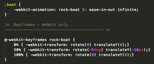
First, we want this boat to rock, so we’ll create a keyframe rule for it where middle one turns it slightly halfway through the animation, then it goes back to its original position. Then we bind it to the appropriate selector using the animation shorthand property. The order of the time values here is important, like it is for the transition property. Here, the first time value is asigned to the animation-duration, and the second to the animation-delay.
However, if we do that it will only play the animation once, so we’ll use the -webkit-animation-iteration-count property. By default, this is set to 1. If you want it to play twice, put in 2, etc. You can also put infinite to have it play forever. Note: you can also put this in the shorthand at the end.
Now, you can actually remove the 0% and 100% keyframe declarations, because they’re basically just reverting back to their default states, which are the same as the original computed values of the boat element, which has no rotation or translation. According to the animation spec, if the 0% or 100% keyframe isn’t defined, the browser will make one using the original properties of the value being animated.
Next, we’ll animate the steam coming out the top. First, set the opacity of the steam in the main stylesheet to 0, so that that will be the starting and end point of the animation. Next, we set up the animations via the keyframe declarations. Note that the second time value is for animation-delay.
Next up we’ll animate the background image at the top from right to left.
Let’s say we wanted to have the animation play backwards. The -webkit-animation-direction property lets you set whether the animation should play in reverse in some or all of its cycles. The value reverse will play all iterations of the animation in reverse. It’s worth noting though that the timing-functions will also be reversed, so in the example below it’d actually be acting like the ease-in function.

 The value alternate cycles back and forth were the odd cycles are normal and the even ones are backwards. For this to work, the animations iteration count needs to be higher than 1 (which it is by default, remember). In this case we’ll set it to infinite.
To switch it so that odd iterations are played in reverse and even ones are played forward, use the value alternate-reverse. For this project, we’re going to keep it as normal, which is the default value, so we don’t need this declaration.
Now, you’ll notice in the original example when the animation finishes, it goes back to the default position specified. By default, a CSS animation will not affect an element until the first keyframe is played, and will stop affecting it as soon as the last keyframe has completed. To get it to slowly halt (which ease-out does) and stay at that last keyframe, we need to use the -webkit-animation-fill-mode property. This lets you define the styles of the animated element before and after the animation runs. The value backwards causes the first keyframe to be immediately applied before the animation runs. This only affects animations with an animation delay value greater than zero, as it extends the values from the first keyframe into the animation delay.
In this first example, notice how due to the animation-delay it pauses for two seconds before starting.


 In the second example, notice the effect setting the -webkit-animation-fill-mode property to backwards has. It makes it so even though it still has a 2s delay, the elements style is based off the first keyframe during it.
Now, this doesn’t fix the awkward jump cut at the end, but the value forwards will. It makes the final keyframe’s styles still apply to the element after the animation is complete. If you want it to have the effect of both backwards and forwards, you can use the value both. You can actually put the animation-fill-mode value in with the animation shorthand as well.
Next we’re gonna animate the frog, who’s current currently positioned off screen with a left: -15%. Because of this, we don’t actually need to include the 0% start keyframe, since by not putting it its value will just be taken from the styling already applied.
First, we’ll add a keyframe to move him onto the screen. Then, we’ll add a second one to make him look like he’s floating up and down. You can list them together in the animation shorthand by comma separating them.

All animations by default run as soon as the page loads. The -webkit-animation-play-state property lets you set that. The default value is running, which plays the animation as soon as the page loads. The value paused tells the browser not to immediately run the animation. This property’s value can also be added to the animation shorthand property. You can then resume the animation with a state change (like the hover pseudo-class) or javascript. Notice below how the background image animation doesn’t play.
And holy shit, just like that I’m done another two sections. Yeaaaaa baby.






 or
or 


