Text, Fonts, and Lists
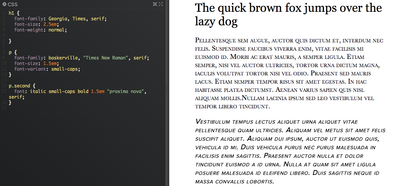
font-family property allows us to specify the typeface for the text in an element. There are two kinds – either a specific font name, like Proxima nova or a general ones like san-serif
typeface is interchangeable with font-family. They are made up of different fonts. So, Times New Roman would be the typeface/font-family, and the different variations of it would be the fonts, like the italicized version, the bold version, etc. Props to this article for explaining that.
Serif fonts have the little markings at the end, called stroke endings, and are usually evenly spaced. Ex Times New Roman and Georgia
Sans-serif fonts have plain stroke endings. Ex. Verdana or Helvetica
Monospace fonts’ characters and letters all have the same fixed width, and occupt the same amount of horizontal space. Ex. Courier and Lucida Console. This is often used to render code examples.
In order for the font chosen to be displayed in the browser, users viewing the sites must have the fonts specified installed on their computer. Web-safe fonts (ex. are Verdana, Georgia, Times New Roman, and Arial) are ones available on all computers, but sometimes you’ll want to use ones they might not have. For that you use font stacks. They let you set a prioritized list of fonts that the browser will cycle through until it finds one that is installed on the users system. The safest ones are serif, san-serif and monospace. It’s good practice to include on of those as the last one in your font stack.

If a font family is made up of more than one word, you’ll need to put it in quotes: “Times New Roman”.
View more font families here.
Many fonts have various styles within their families. You can use the font-weight property to specify how thick or thin the characters are displayed. Common values include normal and bold. Headings by default have a weight of bold. These weights are mapped to a numerical scale of 100 to 900 by 100’s, with 100 the thinnest and 900 the heaviest. You can also use these as the font-weight property values. Normal is equal to 400 and bold is equal to 700. You can also use lighter and bolder values, which are interpreted relative to the weight inherited by the parent. Not all fonts will have all the numerical values, depends on what’s built into the font.
font-size property allows you to set the size of the font. You can do this with keywords or units. There are absolute size keyword values like small, medium or large, and relative size keyword values like larger and smaller, that are relative to the current font-size set. The most common way though is with length units and percentages. Keep in mind, percentages are relative to the parent element’s font-size. So if the parent element was the body of the page, and it was 16px, a font-size of 200% in the child element would be 32px. Same concept for using em units.
Remember – to convert px to em values, you divide the desired element’s pixel value by its parent element’s font size pixel value.
font-style specifies the font style for text. The values it accepts are normal, italic and oblique. normal is the default value, italic makes it slanty by selecting that version from the typeface family, and the oblique makes it look a bit slanty as well. Oblique isn’t used often because a lot of typefaces don’t have them. If you specify oblique and it’s not available, the browser will try to use the italics one, and if that’s not available, then it will make it’s own rendered one for you.
font-variant property sets whether text should be displayed in small caps font, which is a font where the lower case letters appear as smaller versions of upper case letters. Value can be set to small-caps. If a small caps font isn’t available, browsers will simulate one using the upper case characters.
font property is a convenient shorthand property for setting all these things at once. The font-size and font-family must be specified, if they’re omitted the entire line is ignored. Any optional value (font-style, font-variant and font-weight) must be submitted before the size value, and the font-family value needs to be the last one listed.
line-height property specifies the vertical spacing between lines of text. If a page has a lot of text with a lot of lines, a larger spacing between them makes them easier to read. The difference between the font-size and the line-height is the letting, which the vertical space between a line of text. It’s measured from the bottom of the descender (like the bottom of a p) to the top of the ascender (the top of the letters) on the next line.

It can accept five types of values: normal, unitless number value, px, em or %. Normal is the default value and is 1.2. It’s better to define line height with unitless values or relative units, so the line height scales with the size of the text. A common value is 1.5 which the browser multiplies by the font-size to determine the line height. 1.5 is the same as 1.5em and also 150%.
text-align property let’s you set the horizontal alignment of text. Can accept one of four values – left, right, center and justify. left, right and center align the text to that side of its parent element. justify makes it so that every line (except the last) has an equal width, taking up the whole width of its parent element. left is the easiest to read, and the default value for most browsers
text-decoration allows you to set the line decoration of text to none, underline, overline (above the text) or linethrough. Commonly used to remove underlines in links with the none value.
text-indent lets you indent the first line of text with either length units or percentages. It can also accept negative values.
text-transform let’s you control the case, aka the capitalization of the text. values are uppercase (all uppercase), lowercase (all lowercase) and capitalize (each word capitalized).
white-space sets how white space in the element will be displayed. normal is the default value, which ignores and does not render multiple spaces and line breaks. The only time you would use this is if you had already set one of the other values and you wanted to set it back. nowrap value is the most commonly used value, it ignores all whitespace and will not allow text or inline elements to break naturally to the next line. pre value renders content exactly how it was written in the markup, including extra spaces and line breaks, and the spaces in the markup indentation. pre-line value ignores multiple spaces in the markup, but does honor the line breaks. pre-wrap works like the pre value, except that it will not force everything on a single line. It will honor multiple spaces and explicit line breaks. Lines are only broken at new line characters written in the markup.

text-shadow is used to create shadows for text. It accepts 3 unit values, followed by a color. The first value is the horizontal offset, as in how far to the left or right the shadow should fall. The second is the vertical offset, which is the distance from the top to the bottom. The first and second values can also be negative numbers. The third is optional, and specifies the amount of blur aka blur radius applied to the drop shadow. Finally, you put in a color, using keywords, hex code, hgl, rgba, etc.

You can apply multiple shadow values to the same property, by separating them with a comma. The shadows will be stacked one on top of the other, and the shadow declared first will be on top.
overflow property lets you specify what should happen when text overflows its containing element. The value hidden will hide any text that goes past the parent element, but makes it hard for the user to notice the text has been hidden.
text-overflow property is by default set to the value clip, which will clip any text that goes past the parent element. If you use the ellipsis value, it will render an ellipsis character when the text is hidden and clipped, and will replace however many characters necessary for the ellipsis to fit.

word-wrap property gives a simple way of wrapping text within a single word. It allows long and unbreakable words and links to continue onto the next line. The value break-word will do this for you.

List Styles
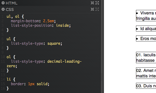
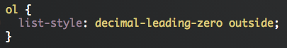
list-style-type property lets you set what the list markers (the dots or numbers) are to the left of an ordered or unordered list. It can accept a bunch of values like: disc, circle, square, and many others, here’s a list of them.

list-style-position lets you set whether the list markers appear inside or outside of a list item. outside is the default value, and the markers appear outside the content flow. The inside value will have them appear inside the content flow. The example he gave had us put borders around the li’s. When I set it to outside, the markers were outside the border, but when I set it to inside they were inside the border.
By default, lists are left indented on the page. IE uses left margins for this, while Firefox, Safari and Chrome use left padding.
list-style-image property let’s you use an image as a list marker. This uses the url() like other properties that set images.


However, it doesn’t give you much control over the position of the image. A more common approach is to set the list-style-type property to none, and then adding the custom marker as a background image to the list items, with the background property. norepeat is a boolean value (I think?) that makes sure the image does not repeat or tile in the background. This lets you accurately control the placement of the image marker.

list-style is the shorthand property that defines all the list style properties in one declaration. It accepts up to all three mentioned above, list-style-type, list-style-position and list-style-image, in any order.
The Box Model
Every html element can be thought of as a rectangular box made up of content, padding borders and margins.

Elements are either displayed as blocks or inline elements.
block level elements create a separate block, that take up the full width available based on the width of it’s parent element, with a new line before and after the element. Examples include div, p, h1-6, ul, ol.
inline elements only take up as much space as they need. They do not force any new lines, and stay inline with the rest of the document. Examples include span, img, strong, a.
The box model is made up of four distinct parts that calculate its size.
content is the inner most area, the area containing the elements actual content, like texts or images.
padding surrounds the content and separates it form the border area above. It’s values can be a length or a percentage, but negative values are not allowed. You can set each property individually, using the padding-top, padding-right, padding-bottom, padding-left properties, or use the shorthand padding property to set the padding for all four sides.
- If you use one value for it, that padding is applied to all four sides
- If you use two values for it, the first value is applied to the top and the bottom, and the second value is applied to the left and the right.
- If you have three values, the first value is applied to the top, the second value is applied to the left and the right, and the third value is applied to the bottom.
- If you have four values, the first is for the top, the second for the right, the third for the bottom, and the fourth for the left side.
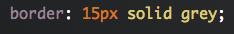
border area is the outer most area of the box. They’re optional, but different styles can be applied to them. They can be set using lengths or percentages. In order to see a border, you must define a border style, and there are three properties you can use for that.
- border-width is used to set the width of the border. Can accept keywords or length units, but negative values are not allowed. Default value for this is medium. It also accepts thin and thick. Like padding, this can have anywhere from one to four specifying the border-width of each side of the box. This works the same way as padding where the number of values you specify affect what they style (see above). You can mix keywords and values
- border-style sets the style of the elements border. Common values include none, which is the default value and specifies no border. dotted applies a dotted border. dashed applies a dashed border. solid applies a solid border. This can also have one to four values, one for each side of the box model.
- border-color sets the color of the elements border. Can use color keywords, hex codes, rgba and hsla values. Once again, you can set all four sides individually if you want, and the separate properties for those are bottom-top-color, bottom-right-color, bottom-bottom-color and bottom-left-color. However, you can also just have them all in one declaration using the border-color shorthand property.

- border is a shorthand property for the three ones listed above. You specify the border width, style and color in that order, with no commas in between them. If no border color is specified, then it will take on the text color of its element. This seems to only work for specifying one value for all for sides for each, it didn’t work when I tried individually setting sides for each value.
margin exists outside of the box. It’s what separates the element from other elements. It accepts three types of values: lengths, percentages and the keyword auto. Negative values are also allowed. If you put a negative value for the top or left sides, it pulls the element in that specified direction. This can make the element move outside of it’s parent element.

A negative margin applied to the bottom or right instead will pull any succeeding element into the main element.

Entering auto as a value will center the child element inside of it’s parent element, so long as a width value has been specified for the child.

Like previous examples, you can define a margin for each side, the properties for that are margin-top, margin-right, margin-bottom, and margin-left. margin is the shorthand property for all four.
With Chrome web tools, in the metrics pane you can examine and edit each element’s box model parameters. Shortcut: click Command Option (or shift) C to turn on inspect element.
display property lets you override the default display settings for an element. The most common values are none, inline, block and inline-block. none will make it so that the element does not display at all or take up any space on the page. block is the default value for block elements. It makes them generate a block element box with a line before and after it. inline places the element inline with the flow of the line the element is in.
Keep in mind, if you want to apply a width, height or top or bottom margin to an inline element, it won’t work, you need to set it to inline-block. This generates a box that’s a block element flowed with surround content, like it’s an inline element. Negative top and bottom margins won’t work with inline-block.
In the example below, notice how the width and margin don’t do anything for the links that are set to inline.


visibility property lets you hide certain elements. The hidden value is kind of like display:none in that it will make the element invisible, but the difference is it will still take up the available space. visible is the default value, the only time you’d use it would be if you’re overriding something previously set to hidden.
By default, a box’s width or height is as big or small as the content it holds. With width and height you can use percentages or length units. If you use a percentage, it will take up that amount of its parent company. em length units will make it relative to the font size. px are still commonly used because they let you set an exact length.
For height, you can’t set a height that would make the element bigger than its parent element, unless the parent is given an explicit height. In the example, if you wanted to set the div height to 100%, you’d have to set its parent’s height (the body element) and than the parent’s parent’s height (the html element).

Keep in mind that when you define a width and height, you’re not setting it for the whole box model (padding, borders, margin), but rather just the content itself. To calculate the width and height of the box, you must take into consideration the padding, and border width/height as well.
Let’s say that you wanted to make a box that was exactly 500px wide. You could do the math to calculate the content width based on how much padding and border you have, or you can use the box-sizing property. Its border-box value forces the padding and borders into the width and height instead of expanding it. This property is well supported, except for IE7 and firefox, which require the -moz- prefix declaration.

You can limit the width and height of your boxes. min-width property specifies the smallest size the box can be displayed when narrow. max-width is the max width the box can be stretched when the browser is wide. You can use max-width to make sure lines of text don’t appear too wide, and min-width to make sure they don’t appear too narrow.

You can also cons1train the height of a box with min-height and max-height. If you were to set a min-height of 480px, the element will never be smaller than that, but will grow if the content exceeds that height. If you set the max-height to 200px, the div will never be taller than 200px, even if the content goes past it or the height property is set to something larger.
Once again, you can handle text like that with the overflow property, which accepts visible, hidden, scroll and auto. visible is the default value, the content is not clipped, and you’d never use it unless it was previously set as something else.

hidden will clip any content that extends beyond the contain box. This can be good for dynamic content where you’re worried your text might break your layout, but it does prevent you from seeing that content.

scroll is the same as hidden, only it adds a scroll bar so you can see the content. This will by default provide both a horizontal and vertical scroll bar. If you don’t need that, the value auto will only provide the scroll bars when needed.

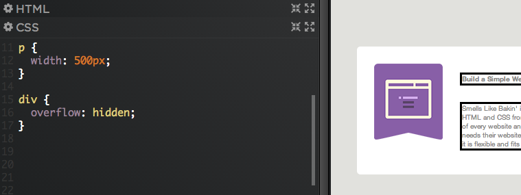
a float is defined as a box that is shifted to the left or the right on the current line. The property accepts three values: left, right and none. One of its most common uses is floating an image with text wrapping around it. floats remove elements from the normal flow of the document. In the example below, the order in the markup was the img, h4 then the p. A border was added to the h4 and the p, and you can see how the floated image just pushes the content out of the way. If you were to add a margin to the p or the h4, it wouldn’t do anything, because that would just put margin between what’s next to it in the document flow.

If a block level element (like this div) contains floated children (like this img and p), it will collapse to no height, requiring a fix by using the clear property, which clears the space around the floats. clear accepts four values: left, right, both and none. none is the default value and it allows floating elements on both sides. left allows no floating elements on the left side. right allows no floating elements on the right side. Finally, with both no floating elements are allowed on the left or right sides.
Now, to make it so that the div doesn’t collapse, you can add an element to the end of the div, like a <br />, then in the css clear the br with clear: left;. However, this is bad practice as it adds a non-semantic element, meaning one that does not clearly define its content. This would be bad for a large site, because you’d have a bunch of unneed tags. A more simple and effective way is to apply the overflow property to the containing element (the div in this case), with a value of hidden or auto. This way also isn’t strongly recommended though because certain parts may get clipped or hidden due to positioning, margins or padding.

The best way to do this is by using a clear fix aka a micro clear fix. This method uses the before and after pseudo elements to generate empty content via the content property. Then, it styles the content with display:table; which creates an anonymous table cell in a block formatting context. The clear property is then used below on the after pseudo element to clear it on both sides.
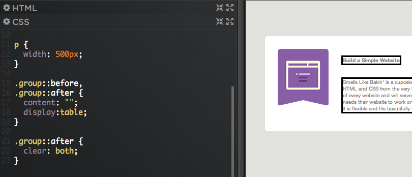
So now anytime you need something cleared, you just add the class group to its containing element (in this case the div containing the floated img, p and h4).
Also for IE6 and 7 support you need to add this:

position property let’s you specify specific positioning schemes and methods. Can accept four values: static, relative, absolute and fixed. static is the default value, it positions its element along with the normal flow of the page, and ignores any values for the top, right, bottom, left or z-index properties. If you don’t declare a position value, it will always be static, so make sure to choose one. relative behaves similar to static in that it changes an element without influencing the layout of other elements. However, with it you can use the top, left, right, bottom and z-index, and it moves it relative to its original place in the document.
See the example below, the middle div is 150px offset from the left, and 75px offset from the top of it’s original position in the document flow.

The absolute value for position completely removes the element from the normal document flow, and therefore no longer affects the position of other elements. You can see if we set the middle div to absolute, the original space it took up in the flow is no longer honored, and it has no impact on the surrounding elements. Now, it sits on top of the bottom div.

Now, you can also use the top, right, bottom, left and z-index properties here as well. However, with absolute positioning, the offsets are based off the browser viewport, rather than the document flow like it is with the relative value. Even if you resize the page, it will remain relative to the browser viewport, and let everything else move behind it.

Now you can change the context by adding a relative position to the parent or any ancestor element. So in the example below, the div with the class “wrapper” is containing these divs, and if you set it to position:relative, it’s child elements will be based off of it when they’re set to position:absolute.

Keep in mind! An element with position:absolute will always be relative to the first parent element with a position set to anything other than static. If none of the parent elements up the chain have this, then it will be positioned relative to the browser window aka the viewport.
You can also position any element set to absolute, inside any other elements set to absolute as well. Here we use generated content via the :after pseudo-class to add in a little black box.

fixed is another value for the position property. Works similar to absolute, but with a few differences. An element will always stay fixed in the browser window, regardless if you scroll up or down. Good example is the twitter header, which always stays fixed to the top of the viewport. So, this positioning will always be relative to the viewport.


z-index property lets you change the natural stacking order of elements, and adds a 3rd dimension to the page, the z-axis. Higher z-index values sit on top of lower ones. Can only be applied to elements positioned absolute, fixed and relative.


NOTE! You can’t apply both position and float to an element, because they have conflicting positioning schemes.
 Kyle's Awesome Awful Websites